상태관리 모듈 중 하나인 zustand 설치합니다.
npm i zustandshadcn-ui에 있는 sheet 콤포넌트 설치합니다. sheet로 나타나도록 할 것입니다.
npx shadcn-ui@latest add sheetzustand를 사용하여 모바일 상태관리 추가합니다.
/books/use-mobile-sidebar.ts
import { create } from "zustand";
type MobileSidebarStore = {
isOpen: boolean;
onOpen: () => void;
onClose: () => void;
}
export const useMobileSidebar = create<MobileSidebarStore>((set) => ({
isOpen: false,
onOpen: () => set({ isOpen: true}),
onClose: () => set({ isOpen: false})
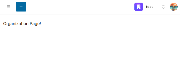
}))기존 navbar.tsx에서 모바일부분이라고 메모한 부분에 MobileSidebar추가합니다.
/app/(platform/(dashboard)/_components/navbar.tsx
import { Plus } from "lucide-react"
import { Logo } from "@/components/logo"
import { Button } from "@/components/ui/button"
import { OrganizationSwitcher, UserButton } from "@clerk/nextjs"
import { MobileSidebar } from "./mobile-sidebar"

export const Navbar = () => {
  return (
    <nav className="fixed z-50 px-4 top-0 w-full h-14 border-b shadow-sm bg-white flex items-center">
      {/* Mobile Sidebar */}
      <MobileSidebar />
      <div className="flex items-center gap-x-4">
        <div className="hidden md:flex">
          <Logo />
        </div>
        <Button variant="primary" size="sm" className="rounded-sm hidden md:block h-auto py-1.5 px-2">
          Create
        </Button>
        <Button variant="primary" size="sm" className="rounded-sm block md:hidden">
          <Plus className="h-4 w-4" />
        </Button>
      </div>
      <div className="ml-auto flex items-center gap-x-2">
        <OrganizationSwitcher
          hidePersonal
          afterCreateOrganizationUrl="/organization/:id"
          afterSelectOrganizationUrl="/organization/:id"
          afterLeaveOrganizationUrl="/select-org"
          appearance={{
            elements: {
              rootBox: {
                display: "flex",
                justifyContent: "center",
                alignItems: "center"
              }
            }
          }}
        />
        <UserButton
          afterSignOutUrl="/"
          appearance={{
            elements: {
              avatarBox: {
                height: 30,
                width: 30
              }
            }
          }}
        />
      </div>
    </nav>
  )
}
mobile-sidebar 영역 생성합니다.
/app/(platform/(dashboard)/_components/mobile-sidebar.tsx
"use client";

export const MobileSidebar = () => {
  return (
    <div>
      Mobile Sidebar!
    </div>
  )
}
새로고침하면 오류 나지 않도록 useEffect이용해서 로딩 끝나면 return 되도록 한다.
"use client";

import { useMobileSidebar } from "@/hooks/use-mobile-sidebar";
import { usePathname } from "next/navigation";
import { useEffect, useState } from "react";

export const MobileSidebar = () => {
  const pathname = usePathname();
  const [isMounted, setIsMounted] = useState(false);

  const onOpen = useMobileSidebar((state) => state.onOpen);
  const onClose = useMobileSidebar((state) => state.onClose);
  const isOpen = useMobileSidebar((state) => state.isOpen);

  useEffect(()=>{
    setIsMounted(true);
  },[]);

  if(!isMounted) {
    return null;
  }

  return (
    <div>
      Mobile Sidebar!
    </div>
  )
}
버턴을 누르면 사이드바가 나오도록 추가합니다.
"use client";

import { AccordionTrigger, AccordionItem, AccordionContent } from "@/components/ui/accordion";
import { Button } from "@/components/ui/button";
import { Skeleton } from "@/components/ui/skeleton";
import { cn } from "@/lib/utils";
import { Activity, CreditCard, Layout, Settings } from "lucide-react";
import Image from "next/image";
import { usePathname, useRouter } from "next/navigation";

export type Organization = {
  id: string;
  slug: string;
  imageUrl: string;
  name: string;
}

interface NavItemProps {
  isExpanded: boolean;
  isActive: boolean;
  // organization: any;
  organization: Organization;
  onExpand: (id: string) => void;
}

export const NavItem = ({
  isExpanded,
  isActive,
  organization,
  onExpand
}: NavItemProps) => {

  const router = useRouter();
  const pathname = usePathname();

  const routes = [
    {
      label: "Boards",
      icon: <Layout className="h-4 w-4 mr-2" />,
      href: `/organization/${organization.id}`
    },
    {
      label: "Activity",
      icon: <Activity className="h-4 w-4 mr-2" />,
      href: `/organization/${organization.id}/activity`
    },
    {
      label: "Settings",
      icon: <Settings className="h-4 w-4 mr-2" />,
      href: `/organization/${organization.id}/settings`
    },
    {
      label: "Billing",
      icon: <CreditCard className="h-4 w-4 mr-2" />,
      href: `/organization/${organization.id}/billing`
    }
  ];

  const onClick = (href: string) => {
    router.push(href);
  }

  return (
    <AccordionItem
      value={organization.id}
      className="border-none"
    >
      <AccordionTrigger
        onClick={() => onExpand(organization.id)}
        className={cn(
          "flex items-center gap-x-2 p-1.5 text-neutral-700 rounded-md hover:bg-neutral-500/10 transition text-start no-underline hover:no-underline",
          isActive && !isExpanded && "bg-sky-500/10 text-sky-700"
        )}
      >
        <div className="flex items-center gap-x-2">
          <div className="w-7 h-7 relative">
            <Image
              fill
              src={organization.imageUrl}
              alt="Organization"
              className="rounded-sm object-cover"
            />
          </div>
          <span className="font-medium text-sm">
            {organization.name}
          </span>
        </div>
      </AccordionTrigger>
      <AccordionContent className="pt-1 text-neutral-700">
        {routes.map((route)=>(
          <Button
            key={route.href}
            size="sm"
            onClick={() => onClick(route.href)}
            className={cn(
              "w-full font-normal justify-start pl-10 mb-1",
              pathname === route.href && "bg-sky-500/10 text-sky-700"
            )}
            variant="ghost"
          >
            {route.icon}
            {route.label}
          </Button>
        ))}
      </AccordionContent>
    </AccordionItem>
  )
}

NavItem.Skeleton = function SkeletonNavItem() {
  return (
    <div className="flex items-center gap-x-2">
      <div className="w-10 h-10 relative shrink-0">
        <Skeleton className="h-full w-full absolute" />
      </div>
      <Skeleton className="h-10 w-full" />
    </div>
  );
};
기존 사이드바에 스켈레톤으로 로딩 표시합니다.
/app/(platform)/(dashboard)/_components/sidebar.tsx
"use client";
import { Accordion } from "@/components/ui/accordion";
import { Button } from "@/components/ui/button";
import { Skeleton } from "@/components/ui/skeleton";
import { useOrganization, useOrganizationList } from "@clerk/nextjs";
import { Plus } from "lucide-react";
import Link from "next/link";
import { useLocalStorage } from "usehooks-ts";
import { NavItem, Organization } from "./nav-item";
interface SidebarProps {
storageKey?: string;
}
export const Sidebar = ({
storageKey = "t-sidebar-state"
}: SidebarProps) => {
const [expanded, setExpanded] = useLocalStorage<Record<string, any>>(storageKey, {});
const {
organization: activeOrganization,
isLoaded: isLoadedOrg
} = useOrganization();
const {
userMemberships,
isLoaded: isLoadedOrgList
} = useOrganizationList({
userMemberships: {
infinite: true
}
});
const defaultAccordionValue: string[] = Object.keys(expanded).reduce((acc: string[], key: string) => {
if (expanded[key]) {
acc.push(key);
}
return acc;
}, []);
const onExpand = (id: string) => {
setExpanded((curr) => ({
...curr,
[id]: !expanded[id]
}));
}
if(!isLoadedOrg || !isLoadedOrgList || userMemberships.isLoading) {
return (
<>
<div className="flex items-center justify-center justify-between mb-2">
<Skeleton className="h-10 w-[50%] "/>
<Skeleton className="h-10 w-10 "/>
</div>
<div className="space-y-2">
<NavItem.Skeleton />
<NavItem.Skeleton />
<NavItem.Skeleton />
</div>
</>
)
}
return (
<>
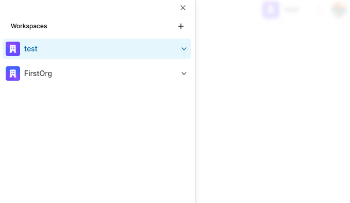
<div className="font-medium text-xs flex items-center mb-1">
<span className="pl-4">
Workspaces
</span>
<Button asChild type="button" size="icon" variant="ghost" className="ml-auto">
<Link href="/select-org">
<Plus className="h-4 w-4" />
</Link>
</Button>
</div>
<Accordion
type="multiple"
defaultValue={defaultAccordionValue}
className="space-y-2"
>
{userMemberships.data.map(({organization}) => (
<NavItem
key={organization.id}
isActive={activeOrganization?.id === organization.id}
isExpanded={expanded[organization.id]}
organization={organization as Organization}
onExpand={onExpand}
/>
))}
</Accordion>
</>
)
}nav-item 부분에도 스켈레톤으로 로딩 표시되도록 합니다.
/app/(platform)/(dashboard)/_components/nav-item.tsx
"use client";

import { AccordionTrigger, AccordionItem, AccordionContent } from "@/components/ui/accordion";
import { Button } from "@/components/ui/button";
import { Skeleton } from "@/components/ui/skeleton";
import { cn } from "@/lib/utils";
import { Activity, CreditCard, Layout, Settings } from "lucide-react";
import Image from "next/image";
import { usePathname, useRouter } from "next/navigation";

export type Organization = {
  id: string;
  slug: string;
  imageUrl: string;
  name: string;
}

interface NavItemProps {
  isExpanded: boolean;
  isActive: boolean;
  // organization: any;
  organization: Organization;
  onExpand: (id: string) => void;
}

export const NavItem = ({
  isExpanded,
  isActive,
  organization,
  onExpand
}: NavItemProps) => {

  const router = useRouter();
  const pathname = usePathname();

  const routes = [
    {
      label: "Boards",
      icon: <Layout className="h-4 w-4 mr-2" />,
      href: `/organization/${organization.id}`
    },
    {
      label: "Activity",
      icon: <Activity className="h-4 w-4 mr-2" />,
      href: `/organization/${organization.id}/activity`
    },
    {
      label: "Settings",
      icon: <Settings className="h-4 w-4 mr-2" />,
      href: `/organization/${organization.id}/settings`
    },
    {
      label: "Billing",
      icon: <CreditCard className="h-4 w-4 mr-2" />,
      href: `/organization/${organization.id}/billing`
    }
  ];

  const onClick = (href: string) => {
    router.push(href);
  }

  return (
    <AccordionItem
      value={organization.id}
      className="border-none"
    >
      <AccordionTrigger
        onClick={() => onExpand(organization.id)}
        className={cn(
          "flex items-center gap-x-2 p-1.5 text-neutral-700 rounded-md hover:bg-neutral-500/10 transition text-start no-underline hover:no-underline",
          isActive && !isExpanded && "bg-sky-500/10 text-sky-700"
        )}
      >
        <div className="flex items-center gap-x-2">
          <div className="w-7 h-7 relative">
            <Image
              fill
              src={organization.imageUrl}
              alt="Organization"
              className="rounded-sm object-cover"
            />
          </div>
          <span className="font-medium text-sm">
            {organization.name}
          </span>
        </div>
      </AccordionTrigger>
      <AccordionContent className="pt-1 text-neutral-700">
        {routes.map((route)=>(
          <Button
            key={route.href}
            size="sm"
            onClick={() => onClick(route.href)}
            className={cn(
              "w-full font-normal justify-start pl-10 mb-1",
              pathname === route.href && "bg-sky-500/10 text-sky-700"
            )}
            variant="ghost"
          >
            {route.icon}
            {route.label}
          </Button>
        ))}
      </AccordionContent>
    </AccordionItem>
  )
}

NavItem.Skeleton = function SkeletonNavItem() {
  return (
    <div className="flex items-center gap-x-2">
      <div className="w-10 h-10 relative shrink-0">
        <Skeleton className="h-full w-full absolute" />
      </div>
      <Skeleton className="h-10 w-full" />
    </div>
  );
};
이제 햄버거 버튼 누르면 메뉴가 나탄나요